Widgets
One of the essential elements of the System are Widgets. Widgets are designed to display information of a certain kind and source, which can be a summary, a value calculated from multiple data, a graph or a function, etc.
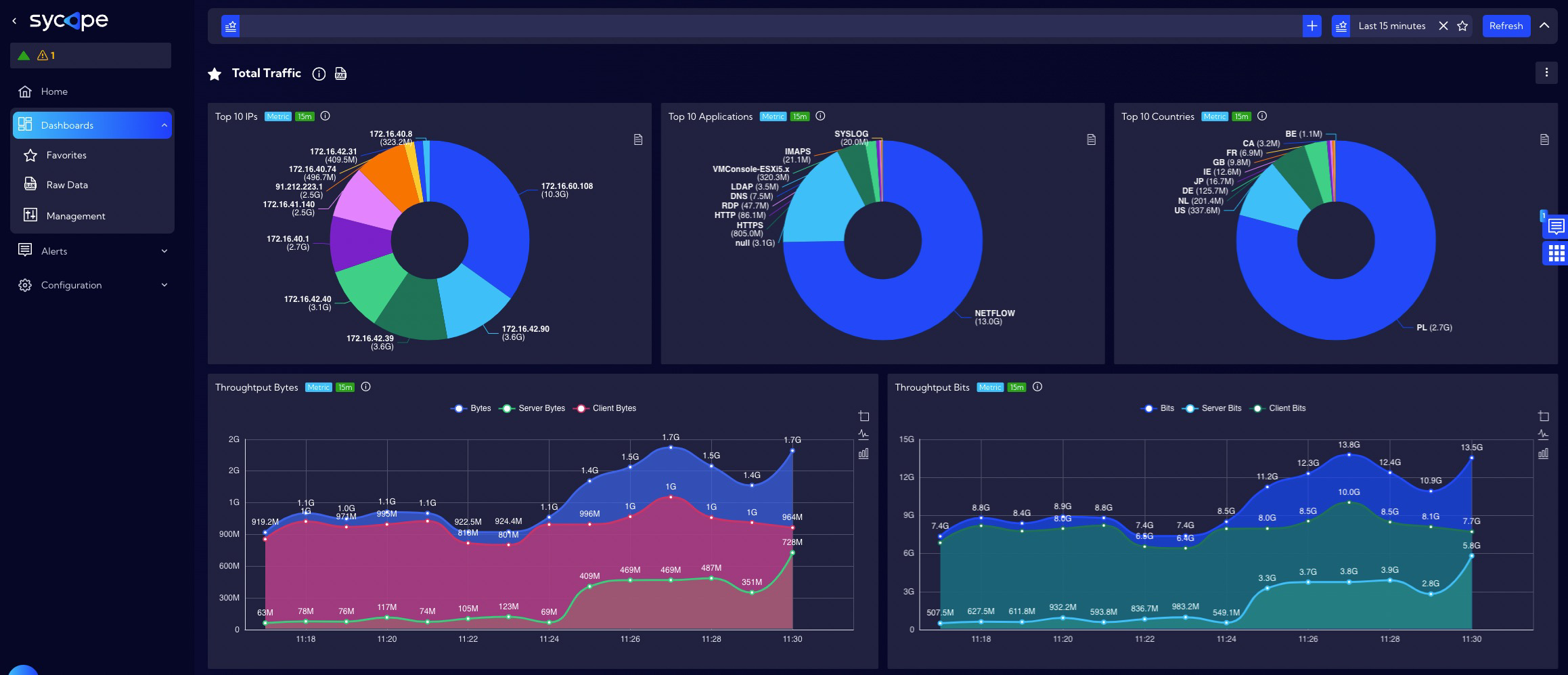
The Sycope includes many different types of widgets designed to fulfill different data display needs. You can add, remove, and customize widgets to personalize your dashboard, displaying the data you need. Widgets are used to create dashboards, which are views that contain multiple widgets.
Adding custom widgets
Widgets are created and edited in this menu [Dashboard>Management>Widgets]. To add a widget, click the Add Widget button, and the widget wizard will appear. Creating a widget consists of three or four steps, depending on the visualization type selected in the first step.
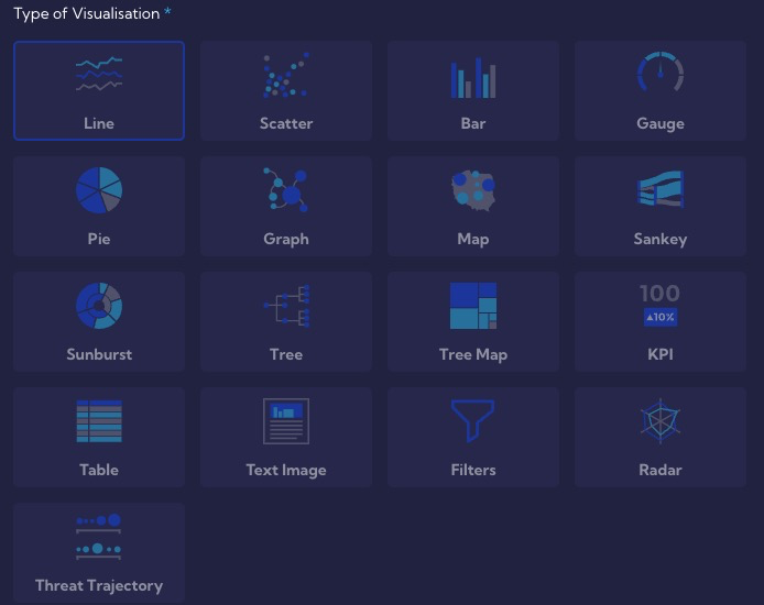
The system includes the following types of visualization:
- Line
- Scatter
- Bar
- Gauge
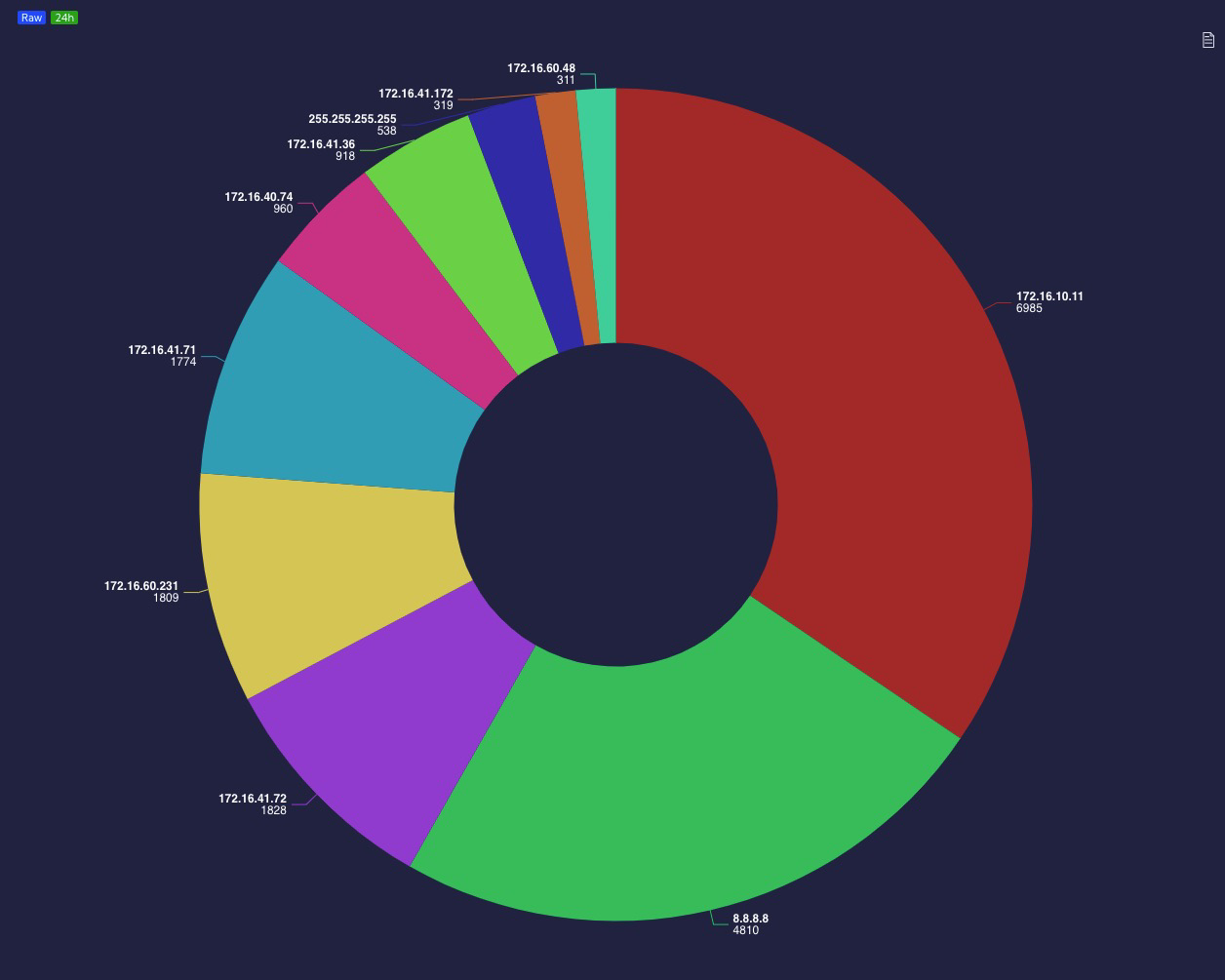
- Pie
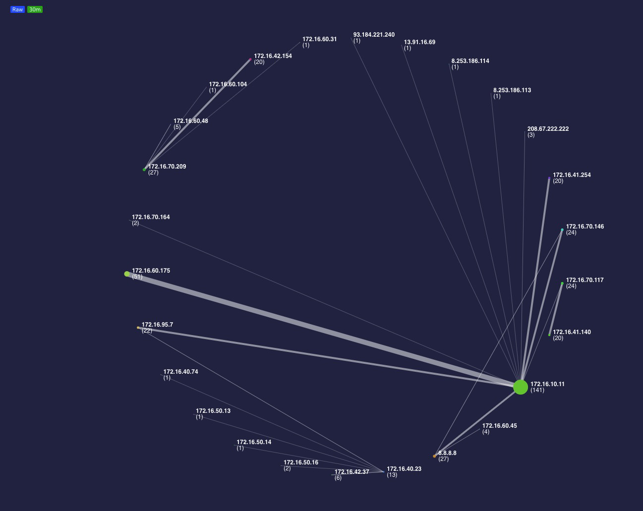
- Graph
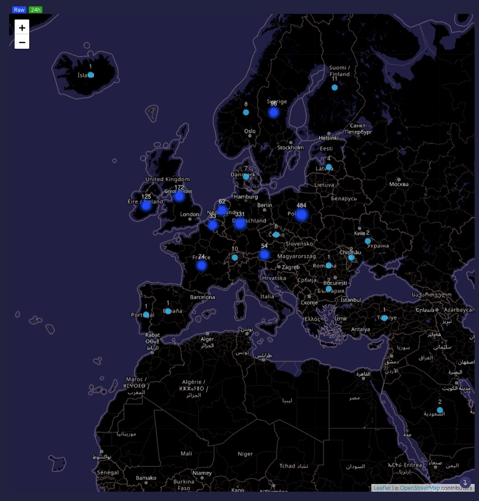
- Map
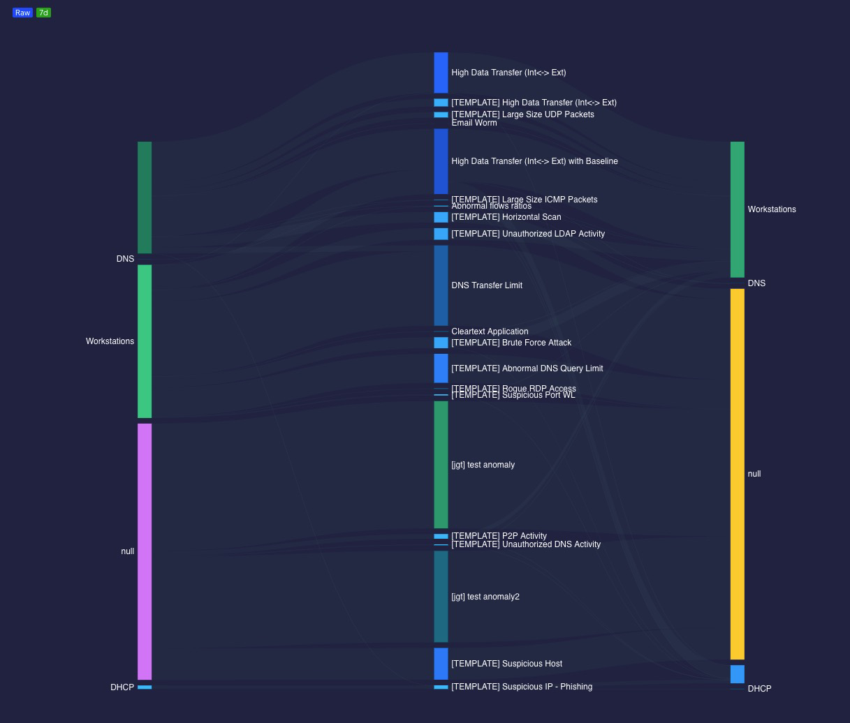
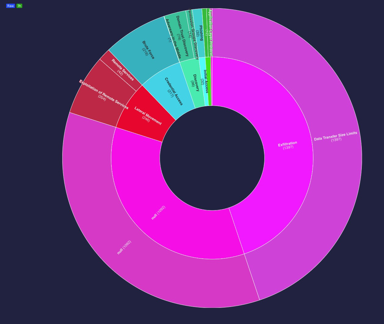
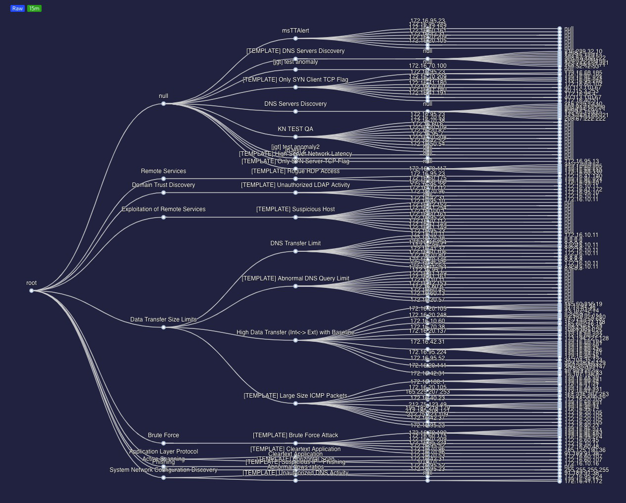
- Sankey
- Sunburst
- Tree
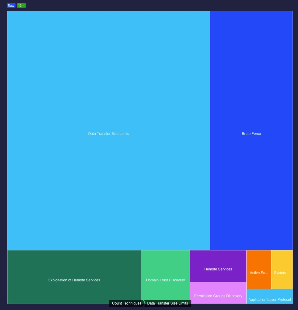
- Tree map
- KPI
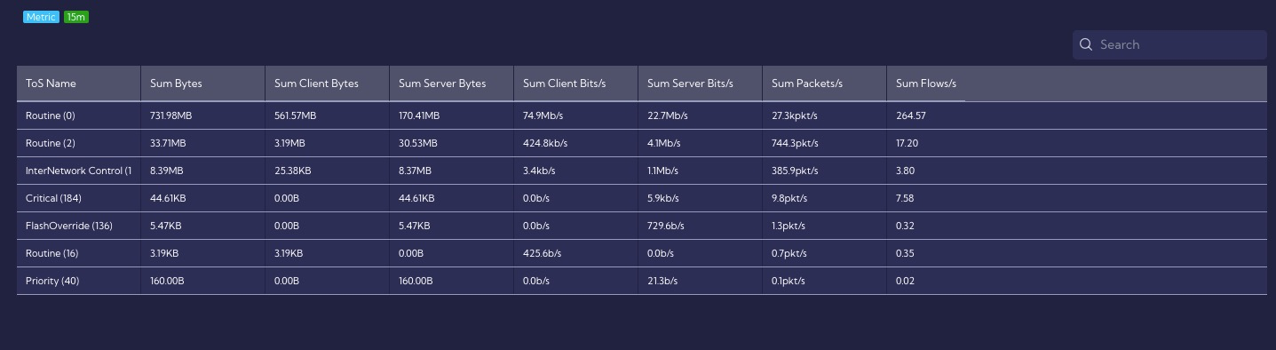
- Table
- Text Image
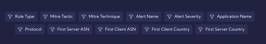
- Filters
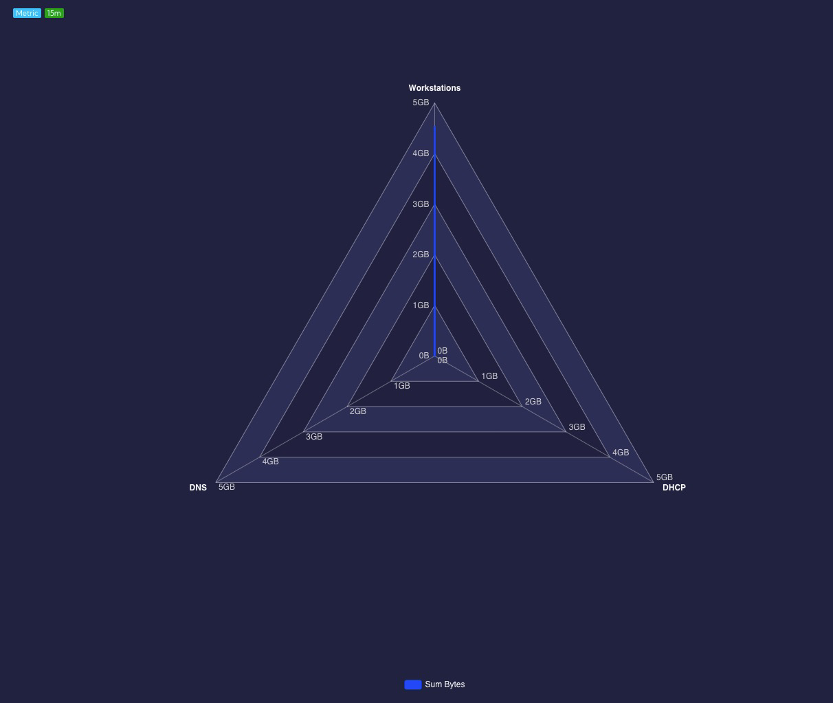
- Radar
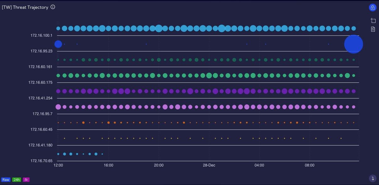
- Threat Trajectory
Visualization step
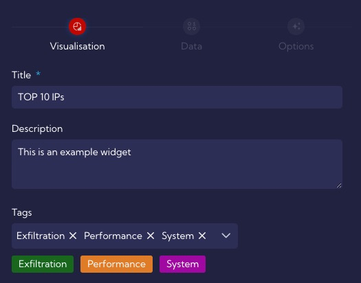
This step is the same for all visualization types. In this step, you need to fill in the following fields:
Title - unique widget name - required field
Description - short description of the widget (not required)
Tags - tags assigned to the Widget
Then you have to choose the Type of Visualization.
Type of Visualization - here, you choose one type of chart from the many available in the system
Depending on the selected visualization, the next step will differ.
Data step
The description of the next steps and options for creating the Widget refers to the Line visualization selected in the first step.
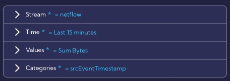
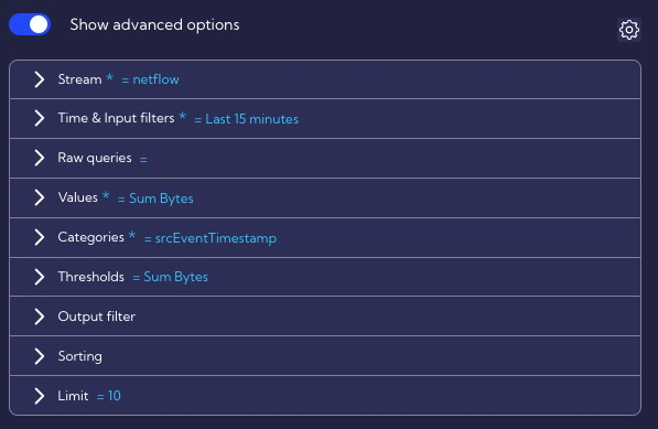
In this step, regardless of the previously selected Type of Visualization, we have widget parameters to configure, divided into several groups. For example, for the Line Visualization, these are the following groups:
- Stream
- Time
- Values
- Categories
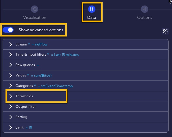
After switching the Show advanced options, additional advanced configuration parameters are available, but using the advanced option mode is highly not recommended!
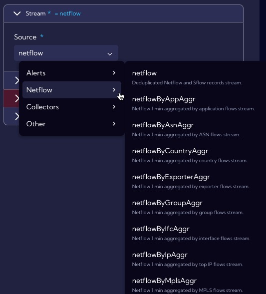
Stream
Source - you have to select a data stream from the list. You can display system data streams with all columns in the [Dashboard>Raw Data ] menu.
For ease of use, the streams are grouped into four categories:
Alerts,
Netflow,
Collectors,
Other.
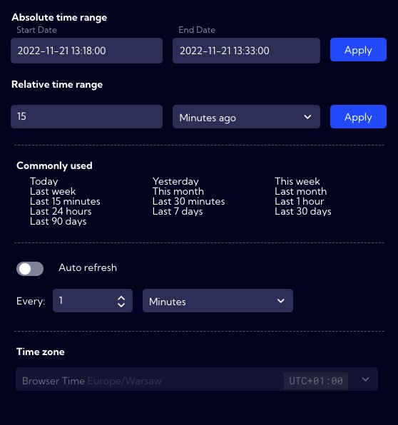
Time
Time range - here, you can specify the time interval for which data should be analyzed - by default Last 15 minutes.
Values
These are the values that will be displayed on a graph.
Field - You can choose Fields or Metrics.
You can add more fields by pressing the plus key.
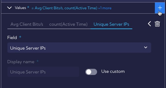
- Use custom - You can enter your name [Display name] for the Field to be displayed on the chart.
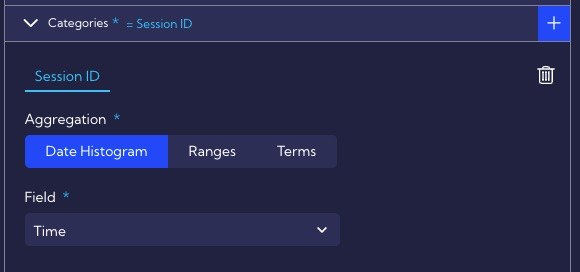
Categories
In this section, you configure the category against which the Values will be displayed.
Aggregation
- Date Histogram
- Ranges
- Terms
Field - field relative to Value that will be visualized
Option step
In this step, the graph parameters are defined.
Switch axes - the switch that changes places of the X axis with the Y axis
Value axis (y-axis)
Axis position
Left
Right
Axis labels
- Show axis labels
- Rotate labels - the angle by which the label will be rotated
- Max width
- Font weight
- Normal
- Bold
- Bolder
- Light
- Font size
- Format type
- Auto
- Currency
- Date
- None
- Number
- Traffic
Axis name
- Display axis name - enable/disable axis name on a chart
- Axis name
- Axis name position
- Start
- Center
- End
- Font weight
- Normal
- Bold
- Bolder
- Light
- Font size
- Distance from chart
- Rotate axis name
Others
- Logarithmic scale
- Invert axis
- Data zoom
- Data zoom init range
Category axis (x-axis)
Axis position
- Left
- Right
Axis labels
- Show axis labels
- Rotate labels - the angle by which the label will be rotated
- Max width
- Font weight
- Normal
- Bold
- Bolder
- Light
- Font size
- Format type
- Auto
- Currency
- Date
- None
- Number
- Traffic
Axis name
- Display axis name - enable/disable axis name on a chart
- Axis name
- Axis name position
- Start
- Center
- End
- Font weight
- Normal
- Bold
- Bolder
- Light
- Font size
- Distance from chart
- Rotate axis name
Others
- Show all labels
- Data zoom
- Data zoom init range
Drilldown
- Type of drilldown
- Dashboard
- Dashboard group
- Filter
- Widget
Privacy
Privacy - you can grant permissions for a Widget
Private - accessible to the owner
Public - visible to all, but You can grant permission:
- DELETE
- EDIT
Shared - accessible to one or more selected User roles. Available privileges are:
- Delete
- Edit
- View
Others
- NULL handling
- Connect
- Set zero
- Show gap
- Show chart in a single mode
- Show legend
- Legend position
- Bottom
- Left
- Right
- Top
- Hide metric name
- Legend position
- Hide if too many records - resolution limit (points on the chart), after exceeding the message set in the Message field (Message if too many records) will be displayed.
- Limit - limit value
- Message if too many records - message when the Limit value is exceeded
- Animation - enable/disable animation effects
Thresholds
The following types of thresholds for Widgets are available in the Sycope system:
- Static Thresholds,
- Dynamic Thresholds (Baseline).
Thresholds for Widgets are configured in the Data step of the Widget Creator, and they are located in the Advanced option/Thresholds.
Static Thresholds
The user in the system can set Static Thresholds on Widgets. They allow the user to set static values lines at the Value parameter's specified level.
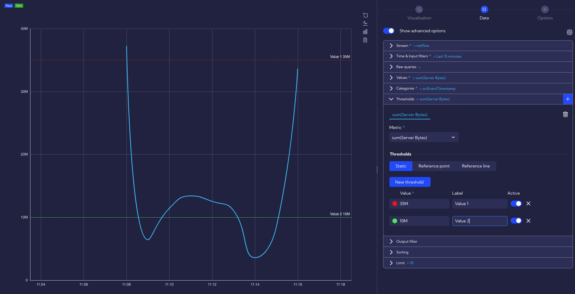
Available parameters for configuration:
- Value - threshold value,
- Label - threshold name,
- Active - enable/disable threshold.
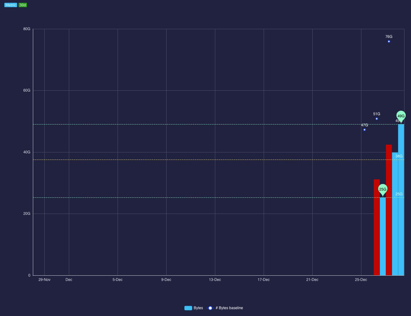
Dynamic Thresholds (Baseline)
Dynamic Thresholds (Baseline) functionality allows the user to compare the same metric/field at different time offsets on a single Widget to perform comparative analysis in different time windows.
Two types of Dynamic Thresholds are implemented in the system:
- Reference point threshold,
- Reference line threshold.
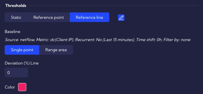
Reference point threshold
The first type of dynamic threshold is the Reference point. It shows a single value of a calculated metric for a period of time offset from the base metric as a horizontal line or range area.
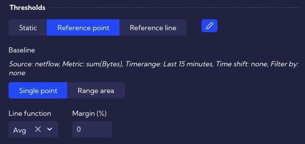
The reference point default calculates the metric's value for the period specified in the Time & Input filters section. You can shift the time range by a set amount of time using the Time shift field - ![]() .
.
Time shift - offset relative to time range - available by clicking

Single point - a single threshold value is determined
Line function - a measure used to determine the threshold value
- Avg - average value
- Max - maximum value
- Min - minimum value
- Prc - percentile
- Sum - the sum of the values in the set period of time
Deviation(%) - percentage deviation for the calculated value
Color - threshold color on the chart
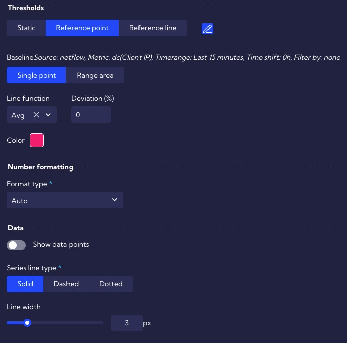
Range area - two values are determined - a "tunnel" is created between them on the graph
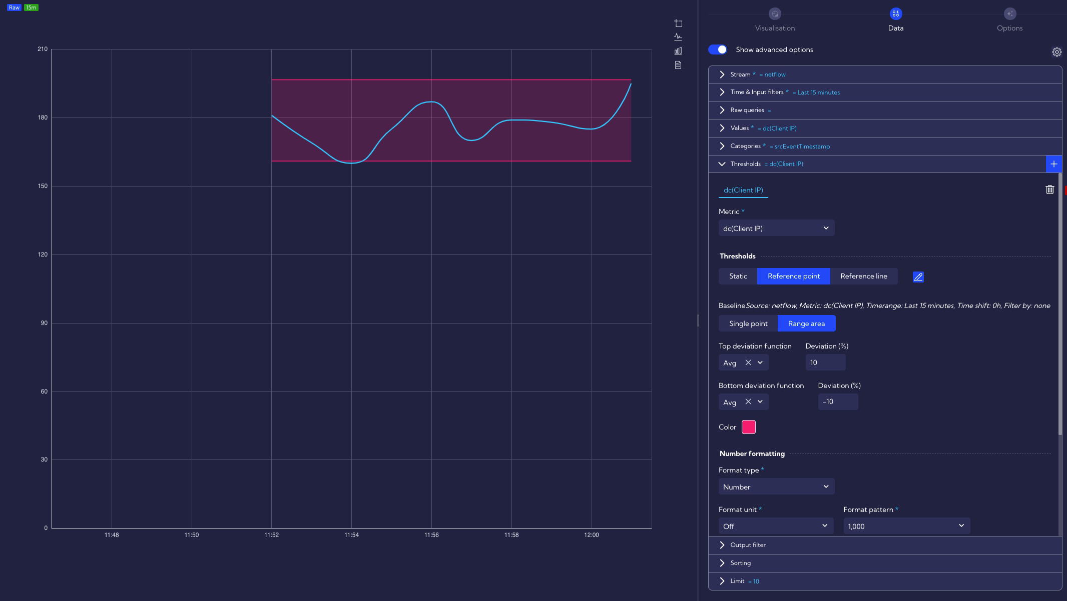
Top deviation function - a measure used to determine the top threshold value
- Avg - average value
- Max - maximum value
- Min - minimum value
- Prc - percentile
- Sum - the sum of the values in the set period of time
Top deviation(%) - percentage deviation for the top calculated value
Bottom deviation function - a measure used to determine the bottom threshold value
Bottom deviation(%) - percentage deviation for the bottom calculated value
Number formatting
Format type
Auto
Currency
Date
Number
Traffic
Data
Show data points - enable/disable the display of points on the threshold chart
Series line type - the type of line used to display the threshold on the chart
Solid
Dashed
Dotted
Line width - here, you can choose the width of the line on the graph for the threshold
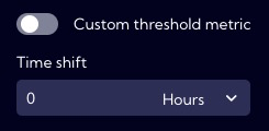
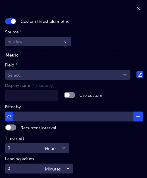
Custom threshold metric
Available by clicking ![]() .
.
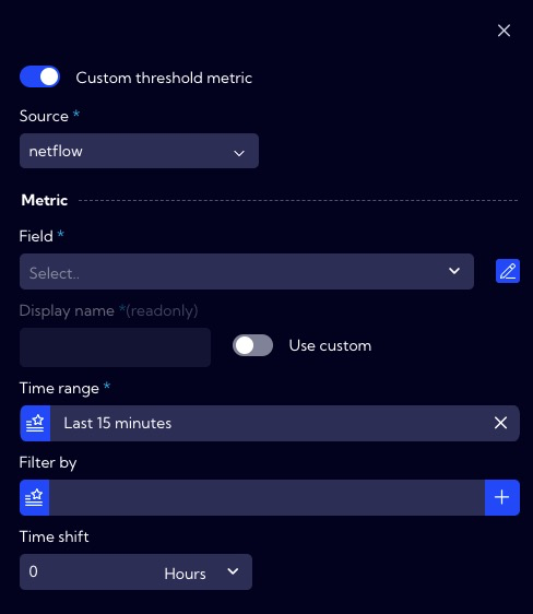
- Source - here, select the data source from which the metric will be calculated
Metric
Field - here, select Field or Metric for the previously selected Source
Display name - the name of the Field/Metric that will be shown on the chart; it can be changed with the Use Custom switch
Time range - time interval for which the threshold will be calculated
Filtered by
- Field - here, select Field or Metric for the previously selected Source
- Operator - here, choose a mathematical operator, for example =, !=, >...
- Value - here, enter the value
- Query Builder - using this option, you can create your own advanced filter using the Query Builder wizard
Time shift - offset relative to the time range
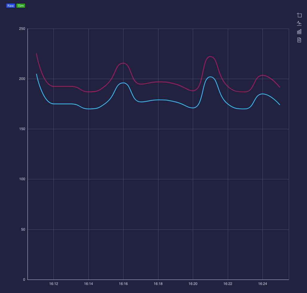
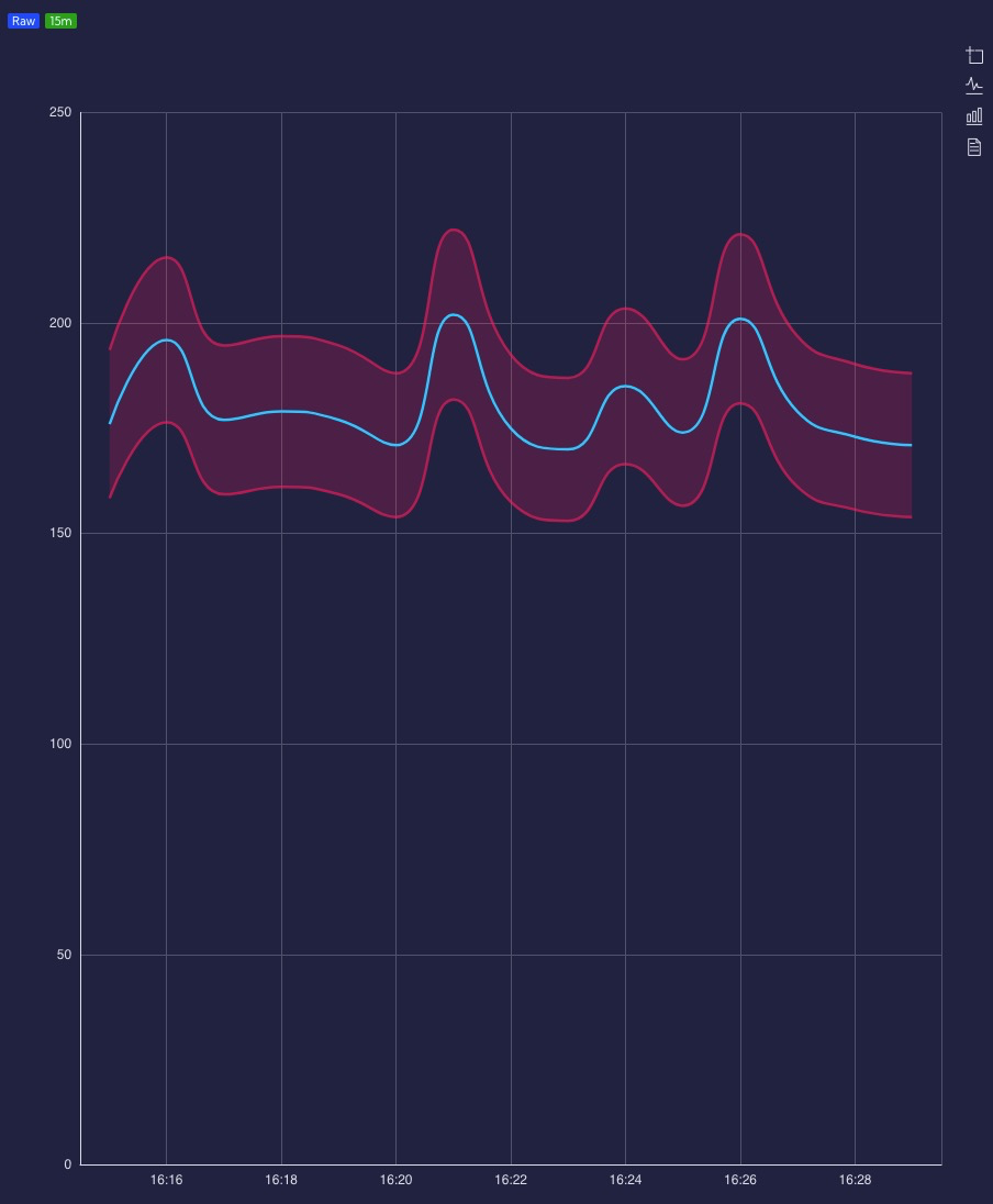
Reference line threshold
It works on the principle of time shifting, i.e., presenting both a series of metrics/base fields and a series of reference metrics on the same (selected in the widget configuration) time interval. Only the values for the reference metric are shifted by a certain period of time in the past.
Available by clicking ![]() .
.
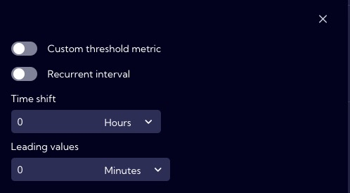
Custom threshold metric - enable/disable wizard to use custom metrics for threshold
Recurrent interval ON/OFF [available by clicking
]- Recurrent type
- Daily
- Weekly
- Time range - time interval for which the threshold will be calculated
- Recurrent type
Time shift - offset relative to time range - available by clicking
Leading values - here, we can specify how many additional data point Reference metrics will be additionally visible to show the average value even though the values of the baseline metric at these time points do not yet exist - available by clicking
Single point - a single threshold value is determined
- Deviation (%) Line - percentage deviation for the calculated value
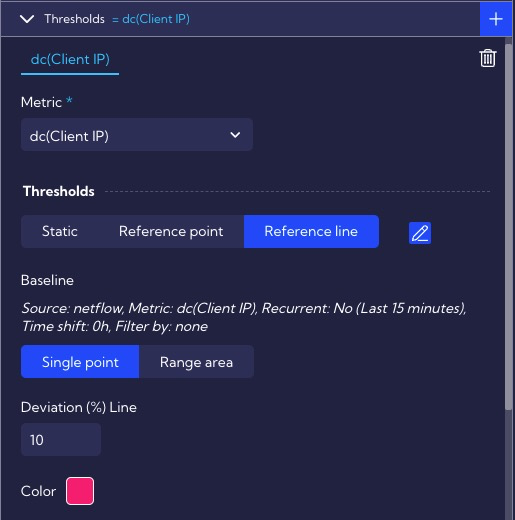
Range area - two values are determined - a "tunnel" is created between them on the graph
Top deviation(%) - percentage deviation for the ceil calculated value
Bottom deviation(%) - percentage deviation for the ceil calculated value
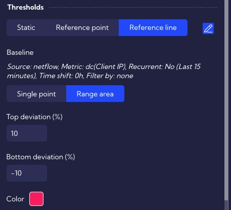
- Color - threshold color on the chart
Number formatting
Format type
Auto
Currency
Date
Number
Traffic
Data
Show data points - enable/disable the display of points on the threshold chart
Series line type - the type of line used to display the threshold on the chart
Solid
Dashed
Dotted
Line width - here, you can choose the width of the line on the graph for the threshold
Custom threshold metric
Available by clicking ![]() .
.
- Source - here, select the data source from which the metric is to be calculated
Metric section
- Field - here, select Field or Metric for the previously selected Source
- Display name - the name of the Field/Metric that will be shown on the chart; it can be changed with the Use Custom switch
- Filtered by
- Field - here, select Field or Metric for the previously selected Source
- Operator - here, choose a mathematical operator, for example, =, !=, > ....
- Value - here, enter the value
- Query Builder - using this option, you can create your own advanced filter using the Query Builder wizard
Build-in Widgets
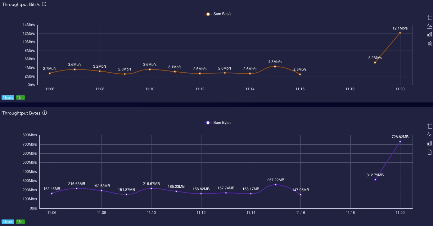
Line
Scatter

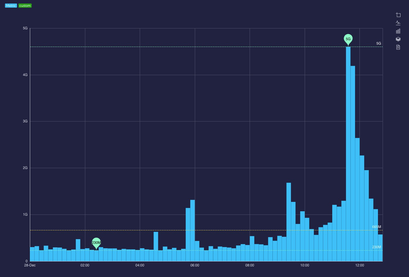
Bar
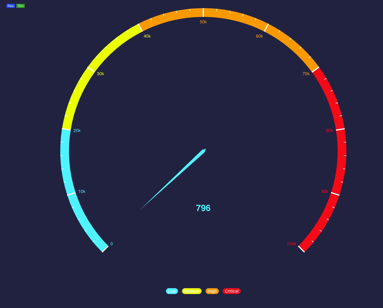
Gauge
Pie
Graph
Map
Sankey
Sunburst
Tree
Tree Map
KPI

Table
Text Image


Filters
Radar
Threat Trajectory